Saturday, November 1, 2014

7 essential elements of a perfect blog post - Executive Summary

  1. Headline: the 6 words that count most
  2. Storytelling hook
  3. Fewer characters per line at first
  4. Featured image
  5. Subheads for scanning
  6. Content and the 1,500-word sweet spot
  7. Soundbites for sharing


How to write the perfect headline


Eight out of 10 people will read your headline. Two out of 10 will read the rest of what you wrote. Stats like this 80/20 rule from Copyblogger illuminate the fact that headlines are often the make-or-break moment for each and every blog post. So how do you make a headline great?
Readers tend to absorb the first three words of a headline and the last three words, revealing that we don’t just scan body copy—we scan headlines, too.
Of course, few headlines will be six words long in total. In those cases, it’s important to make the first three words and the last three words stand out as much as possible. 
In terms of SEO, the headline (or title tag) will need to be around 55 characters or fewer in order to fit the entire title on a search results page and avoided being abbreviated with an ellipse.
  1. Surprise – “This Is Not a Perfect Blog Post (But It Could’ve Been)”
  2. Questions – “Do You Know How to Create the Perfect Blog Post?”
  3. Curiosity gap – “10 Ingredients in a Perfect Blog Post. Number 9 Is Impossible!”
  4. Negatives – “Never Write a Boring Blog Post Again”
  5. How to – “How to Create a Perfect Blog Post”
  6. Numbers – “10 Tips to Creating a Perfect Blog Post”
  7. Audience referencing – “For People on the Verge of Writing the Perfect Blog Post”
  8. Specificity – “The 6-Part Process to Getting Twice the Traffic to Your Blog Post”

Start your post with storytelling

The headline entices readers to clickthrough. The intro hooks readers into continuing.

Cut down on characters per line by using a featured image


Visuals are hugely important, and it helps to draw attention with a catchy image up top.
There’s another reason for the image, too. Characters per line.
Placing an image at the top right/left of your blog post forces the first few lines of the post to shorten in width. This shortening leads to fewer characters per line. Fewer characters per line has a psychological effect on the way we view contentThe fewer the characters, the easier the text is to comprehend and the less complex it seems.
If you’re opposed to a featured image, there’s another way of achieving fewer characters per line. You can boost the font size of your opening paragraph.
If you’re comfortable with code, there’s a neat CSS trick you can do to make this happen on your own blog. Add this to your CSS file, replacing the font size with the actual size you’d like to see.
p:first-child { font-size: 1.5em; }

Subheads, subheads, and more subheads

Perhaps you’ve heard that people don’t read on the Internet, they scan.
It’s not true for everyone, but it’s true for a large enough majority that setting up your content to be scannable is an absolutely essential element of a perfect blog post.
Use subheads to make your post scannable.
  • H1: post / page title
  • H2′s and H3′s: subheadings and sub-subheadings
  • H4: your blog’s name, and possibly related widgets
  • H5: same as above: sidebars etc.
Basically, these tags are signifying a content’s importance both to the reader and to search engines. 

Write the perfect amount of content


Blog posts of 1,500 words or more tend to receive more shares.
Quick Sprout has some interesting data behind this recommendation. They cite research from a popular online journal that tested the Twitter, Facebook, and LinkedIn shares of all its post, broken down by word count. The longer the post, the more shares the post got.
social shares
(The stats above would suggest that the bare minimum in length should be 700 words. That’s where shares really started picking up.)
Of course, with longer content comes the necessity to make it as scannable as possible. The Nielsen Norman Group found that people only read 28 percent of the words in a blog post. Subheads (as mentioned above) are a great way of making your post scannable so readers can find the content they want
  • Lists – bulleted and numbered
  • Blockquotes
  • Bold text in paragraphs
  • Short paragraphs
  • Visuals

Add a ‘tweetable’ or two to your content

People love to share quotes on social media. Make your perfect blog post as quotable and shareable as possible.


To make a soundbite or tweetable, pull the best bits from the content you’ve written and include a “Tweet This” or “Share This” link alongside the text. Make the text stand out so that readers (i.e., scanners) can quickly see your most notable and shareable words and so they can easily click to share.
There are some neat WordPress plugins that can help you here, as well as some online tools.
Click to Tweet website – The website tool lets you build a tweet to include in any post, and your work gets saved on their site to edit or track clicks after the fact.
Click to Tweet WordPress plugin – The team at TodayMade (makers of CoSchedule content calendars) built a tool to share quotes from inside blog posts. The implementation is really beautiful. 

4 little things to look for in your perfect blog post


1. Place a call to action in your post

—the sidebar, the header, and the footer get our most prominent CTAs and the text itself has a handful of internal links sprinkled throughout. Links are a standard part to the majority of successful blog posts out there. Blog Pros’ study of 100 high-ranking blog posts noticed that these posts averaged nearly 10 links inside each story.


2. Visual content is essential


We remember photos 6 times easier than text. So not only will people enjoy reading your blog more if you include beautiful photos, they’re more likely to remember it too.

 The 100 popular blog posts averaged one visual image for every 350 words. 


3. Include social share buttons


4. Create a usable, readable, searchable URL


Google has revealed that it is best to use three to five words in the slug of your permalink. Additional words will be weighed less and could even appear spammy. So keep your permalinks short and take care to place important keywords first!


While keeping in mind the search engines, also keep in mind us humans. Be descriptive with your URL so that someone who sees the link can know what they can expect to see if they click.
For instance, this:
http://blog.bufferapp.com/inside-the-ideal-blog-post-the-research-and-science-behind-the-perfect-post
Can become this:
http://blog.bufferapp.com/ideal-blog-post-research

Timing: Blog posts get more shares on the weekend

Blog posts get more shares on Saturday and Sunday than any other day of the week.
 Essentially, when there’s less competition, the more your post stands out. When nothing is on late at night, infomercials get their most play, and a similar comparison could be made to content posted on the weekends.

Perhaps boost some promotion on the weekends or even consider posting original content that doesn’t have to compete with so much other content (only 13 percent of the 1.2 million blog posts in the Track Maven study were published on the weekends).
Beyond the best day of the week for social shares on blog posts, Track Maven also found some interesting data about the time of day when posts can expect to see the most shares. (Note: all times are Eastern standard.) Below, the two charts show when during the day blog posts are published (the green chart) and when during the day the most social shares happen (the purple chart).
Screen Shot 2014-05-23 at 11.08.14 AM
Shares tend to spike early in the morning and again late at night, with steady, lower sharing throughout the day.

Great blog posts are …
  1. Actionable
  2. Relatable
  3. Urgent
  4. Visual
  5. Solution-based
  6. Entertaining
  7. Definitive

Sunday, October 26, 2014

How to Write a Business Letter:

Marcio Jose Sanchez/AP; Elisa Glass/The Atlantic
The Earl of Chesterfield, the 18th-century British statesman and patron of the arts, had a number of concerns about his illegitimate son Philip, but one he revisited often in his posthumously published letters to the boy is about Philip’s correspondence. This species of worry ranged from handwriting (“shamefully bad and illiberal; it is neither the hand of a man of business, nor of a gentleman, but of a truant school boy”) to the boy’s prose style (“one principal topic of our conversation will be, not only the purity but the elegance of the English language; in both which you are very deficient”).
The latter became a particular concern after Chesterfield went to the trouble of setting the boy up in the world. In December 1751, he offered Philip some delightfully modern-sounding advice on his business correspondence:
The first thing necessary in writing letters of business, is extreme clearness and perspicuity; every paragraph should be so clear and unambiguous, that the dullest fellow in the world may not be able to mistake it, nor obliged to read it twice in order to understand it. This necessary clearness implies a correctness, without excluding an elegance of style. Tropes, figures, antitheses, epigrams, etc., would be as misplaced and as impertinent in letters of business, as they are sometimes (if judiciously used) proper and pleasing in familiar letters, upon common and trite subjects. In business, an elegant simplicity, the result of care, not of labor, is required.
In case Philip might mistake his meaning, and perhaps reasoning that a demonstration of his recommended prose style was worth much more than a mere description of it, His Lordship added, “Let your first attention be to clearness, and read every paragraph after you have written it, in the critical view of discovering whether it is possible that any one man can mistake the true sense of it: and correct it accordingly.”
Lord Chesterfield (Wikimeda Commons)
Lord Chesterfield’s advice on business writing, published in 1781, joined a heap of careful and voluminous 17th- and 18th-century attention to business correspondence. Titles such as The Young Secretary’s Guide, Or A Speedy Help To Learning; The Complete Art of Writing Letters; and Every Man His Own Letter-Writer were immensely popular bestsellers;The Young Secretary’s Guide went through more than 20 printings and piratings, from 1703 well into the 1750s. And if imitation is the highest form of flattery, we can gauge something of the book’s status in the fact that in 1730, someone got the bright idea to call his version The Young Secretary’s Guide Compleated: Being the Speediest Help to Learning. (This time, with 57 percent more learning.)
The format of the manuals, which were large collections of letters between imaginary but archetypal characters, also lent itself to recycling. An introductory letter to the reader would always lay out the general principles of entering into correspondence and the purpose of the manual: As the century went on and these manuals acquired ever increasing numbers of imitators, some of them would use this opportunity to explain, eloquently, the necessity of another entrant into the lists. Although we must allow for a certain natural exaggeration in what essentially amounted to a sales pitch or the 18th-century version of jacket copy, it’s from these introductory notes that we get a sense of the great regard in which business correspondence, and letter-writing generally, was held. From Every Man His Own Letter-Writer, for instance, we learn that “the importance and necessity of letter-writing, as it relates to our social and commercial concerns in every rank and station in life, are so evidently apparent, as to stand universally confessed…it becomes the duty and interest of each individual member of the community, to acquire a competent knowledge in an art which equally redounds to their credit and advantage.”
After this self-justification would follow a table of contents of each kind of letter contained within the book: a clear necessity, as the manuals represent just about every possible situation one can imagine occurring under the conditions of early British capitalism. Sample letter titles: “From a Shopkeeper in the Country to a Tradesman in London, Complaining of the Badness of his Goods” and “From one Friend to Another, generously offering him Assistance, on his having sustained great Losses by the Failure of a Correspondent” and the perennially popular “From a Guardian to His Ward, against a volatile, frothy French lover.”
A 1721 edition of the Secretary's Guide (Google Books)
As the genre—like Chesterfield’s letters to his prodigal son—was ostensibly directed at the young and naïve, almost every example of it follows a natural progression, from children writing to their parents thanking them for placing them in apprenticeships, or (in the case of daughters) in service, to masters writing up apprenticeship contacts once they had completed their own apprenticeships and acquitted themselves with enough linguistic propriety to advance in the world of business. Some later manuals tend to follow the same characters, from errant apprentices writing to their fathers for more pocket money, to young men writing to prospective father-in-laws to ask for their dowries and daughters, to older men writing to excuse their debts or requesting that debts to them be paid. The ubiquity of letters about every possible permutation of debt is especially prone to the creation of characters, whom you can follow through initial requests to successful (or unsuccessful) petitions to their creditors, and their creditors’ replies.

Go Ask Alice - Clarifying Business For Your Audience.


While surfing the web one evening after work I came across this Twitter status:

アリス・リデル on Twitter:
"How can she stem this growing corruption or assist my search?
What does she know that I don't?"

 https://twitter.com/Alice_AMR/status/526293712263868417

It was a moment of clarity for me.
Humorous, insightful, and a Revelation to me in that moment.

   I was not asking Alice when she was ten foot tall, but Alice was asking me when I was ten foot tall.

Often times when working on complex cases, I have used the Alice in Wonderland branding  symbolically to soften my image. Perhaps it is a comfort zone of recall from a childhood little theater productions that engulfed most my early years. Where ever this bell was tolling it was profound.

Alice was asking me questions that I should be answering for her.

How can I stem the growing corruption or assist her on her search?
What do I know that she does not?


Techniques For Giving Better Presentations

the content is the most important part of your presentation. All the bonus stuff—the animated slides, the videos, the jokes—can’t compensate for lack of compelling content.
What’s more, your content should stand out from what other people are saying. 

You have to take a stance and differentiate yourself from what’s out there. 
That's the part that people forget when it comes to presentations. They try to be everything to everyone, but you can’t. 

The goal of a presentation is to change someone’s beliefs or behaviors. If you don’t take a stance, if you’re too vanilla, you can’t change other people’s behavior.

Rock stars use production elements like lighting to shape the emotional effect of their presentations. As a corporate speaker you may be able to do that to some extent, but mostly you communicate emotions through your personality, your passion, and stories from your life. 

Three recommendations.

First, be authentic. Don’t try to be funny if you’re not. Don’t pretend to be a bigger company than you are. Don’t pretend to be more knowledgeable than you are. And don’t pretend that you want to be there if you don’t. Audiences can sniff out a fraud in 30 seconds.

Second, be confident. At an M.I.A. ladies were gushing: “She has so much swagger! I wish I could have some of that.” Confidence is attractive. Frank Sinatra, who was a physically unimposing high-school dropout. But through his self-confidence, he made the most of his talents as a musician, actor and businessman.

You can’t fake confidence, so it’s best rely on your expertise, practice and preparation

Finally, be likeable. Make an effort to be relatable, friendly, and open. It helps build relationships with audiences. Some adopt a more punk attitude. and break free of the constraints of likeability. But as a public speaker, you’re better off taking the route of Taylor Swift than Courtney Love.

Rock stars really wow us when they simplify. Some of the best business talks I’ve seen have been simple. No slides, no videos, no New Yorker cartoons, no fancy infographics. But they had a meaningful message that resonated with me and was all the more memorable for the lack of frills.

Finally, go for broke. Give a great show each and every time on the stage. “Business people somehow believe that if they didn’t sleep well or had a bad flight, they can be off their game, That’s wrong. When you’re trying to present,when you trying to influence people, when you’re trying to change behavior, you better bring it. You get one shot to get it right and you’ve got to go for it.

After a good show, people talk. They buy the t-shirts, they share on social media. Presentations are the same. “If you do a good presentation, people talk about it afterwards.It will lift you and your career. If you do a lousy job, then boy it’s a missed opportunity.”

VIA http://www.forbes.com/sites/ruthblatt/2014/10/16/rock-stars-techniques-for-giving-better-presentations/

Wednesday, October 1, 2014

Why Collaborate?

An excerpt from the DoJ 's 

Collaboration Toolkit For Community Organizers: 


Perhaps the most convincing arguments for developing partnerships among
community organizations and their local law enforcement agencies are
seen in the benefits attained by communities that have implemented these
partnerships. For example, effective community–police collaborations can:

◆ Provide a more systematic, comprehensive approach to addressing
community crime and disorder problems
◆ Accomplish what individuals alone cannot
◆ Prevent duplication of individual or organizational efforts
◆ Enhance the power of advocacy and resource development for the
initiative
◆ Create more public recognition and visibility for the power of
community-police cooperation.

A collaborative partnership between your law enforcement agency and
the individuals and organizations it serves is essential to finding answers
to community problems. Today’s law enforcement agencies recognize
that police rarely can solve public safety problems alone and encourage
interactive partnerships with community groups and other stakeholders.

These partnerships can be used to accomplish the two interrelated goals
of (1) developing solutions to problems through collaborative problem
solving and (2) improving public trust.

The .pdf : http://ojp.gov/fbnp/pdfs/Collaboration_Toolkit.pdf

Tuesday, September 23, 2014

Planning Timelines - Research

Hi! 

I want to create a nice and informative timeline for my journals. 

These are the  top 5 noted timelines programs I researched. . 


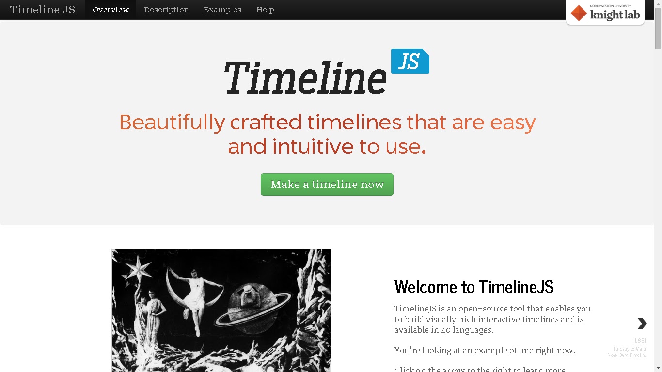
My favorite is Time Line Knight Lab

On TimelineKnightslab.com you can use your JSON skills to enhance your timeline.

Time Glider https://timeglider.com/signup is a top runner up aimed for high-school administrators and class. 


Amazingly, at least at this writing, free time line.com was a simple clean plain working timeline generator: http://www.free-timeline.com/

Excellent for planning timelines. Though I am not certain of their fine print, because well there is not. Tread with care .

Meograph is an excellent in-time, synchronized  data collection timeline https://secure.meograph.com/newuser   


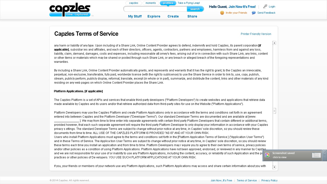
The big hiss goes to  http://www.capzles.com/#/terms-of-service/


The terms of service does not have state nor country filled in, among other finer details, which were blank on the contracts. Interesting... 
Do they plan to fill them out later?


From a intellectual property ( IP ) security view point. Capzles really sucks.

Wednesday, January 22, 2014

7 Simple and Proven Tips to Increase Your Blog Subscribers

This article originally appeared in Buffer
A blog about productivity, life hacks, writing, user experience, customer happiness and business.
Running a blog is so much more rewarding when you know people are reading, enjoying and sharing your work. If you’re managing a blog as part of your business, you probably want people to find and buy your products through your blog, as well. So increasing subscribers is an important task for bloggers.
These are some fairly simple hacks that you can implement without too much fuss, which should boost your subscriber numbers.

1. Lower your bounce rate – here is how

Cameron Chapman explained in a post on the Kissmetrics blog how he kept the bounce rate under 2% on his blog. His first tip is simple navigation:
The big thing here is that there’s no fancy, complicated navigation. No assisted search. No mega drop-down menus. It’s no more complicated than it absolutely has to be.
What I found most interesting was how much Cameron stressed the overall design. Both consistency and a focus on simplicity are more important than trying to pack as much as possible onto first. Another thing that stood out was the focus on navigation bars, the more easy they are to see, the more likely a visitor is to feel they are seeing something they’re already familiar with.
Another tip Cameron had is to only publish excerpts from your blog posts on your home page, which is something a lot of blogs do extremely well. Some great ones to see do this areCopyblogger, the KISSmetrics blog homepage or 99U.  This means that if your visitors want to keep reading a post, they’ll need to click through to the post’s own page. Cameron said the trick to this was in the content your readers see before clicking through:
Make the first couple of paragraphs of your posts interesting and engaging. Avoid copy that tries too hard or goes for the hard sell. The goal is to get your visitors to click through to more of your content.
99u
I’m a big fan of showing each blog post’s category, since I like to find more like it if I enjoyed the post. Cameron explained how he does this on his blog posts, and why it’s important for keeping his bounce rate low:
Since I don’t have a sidebar on the individual post pages, there’s a section at the bottom that lists the categories and keywords that the post is tagged with. (The category is also listed at the top of each post.) This makes it simple for visitors to find related posts.
Keeping the links at the end like this makes sense on a blog, where a lot of readers will be scrolling down to see comments on the post. Internal links also mean that there’s more opportunity for visitors to click through to other pages, rather than clicking their back button.
So if you want to implement some of Cameron’s advice immediately to start decreasing your bounce rate, here’s what you could do:
  1. Ensure your site has simple, consistent navigation on every page
  2. Only publish excerpts of your blog posts on your home page
  3. Add tag and category links to each post
Our friends over at analytics tool KISSmetrics also have an amazing infographic explaining how to best improve your bounce rate:
Screen Shot 2013-08-07 at 10.35.04 AM

2. Use a pop-up to catch email addresses (it won’t hurt!)

Social media scientist Dan Zarrella did some data exploration on his own site, to see how well his email capture pop-up worked, and how it affected his bounce rate.
Here’s what the pop-up looks like when you visit Dan’s site now:
Screen Shot 2013-08-07 at 10.37.07 AM
Sometimes these are called lightbox pop-ups, because they often grey-out the content underneath.
The data Dan found is really interesting, because his bounce rate was barely affected when he had the pop-up enabled. In fact, it only rose by 0.5% when the pop-up was turned on for new visitors. The email subscriber rate, however, dropped dramatically when Dan turned off the pop-up:
Screen Shot 2013-08-07 at 10.38.02 AM
I found that during that period my signup rate dropped dramatically. I was collecting far fewer emails from visitors. Also during that time, there was no noticeable change in bounce rates. Viewers didn’t seem to mind the popup at all.
Here’s how Dan summed it up:
To me this is a no-brainer. It’s not even a trade off between any kind of measurable visitor dissatisfaction and more emails. It’s just more emails.
And Dan’s not the only one. Nikki McGonigal from Nikki, In Stitches found a big difference between her sidebar subscription form and her pop-up in the number of email subscriptions they received:
Screen Shot 2013-08-07 at 10.39.59 AM
Adding a pop-up to capture email addresses is fairly easy, as most blogging platforms and email newsletter services offer widgets or built-in options for setting one up. You can easily google “email lightbox” + the name of your email newsletter service or blog host, but I collected links to a few popular ones to start you off:

3. Optimize your loading time – 1 sec loading means 7% drop-off

We know that users don’t like to wait, it’s especially something we’ve tested before extensively, since we’re all used to technology being so fast these days, and blog readers aren’t much different. Slow loading times can be an easy way to lose visitors to your blog before they get to read your content, let alone sign up for more in their inboxes!
Sean Work from Kissmetrics collected some interesting stats about loading times. One fact that surprised me the most was this: A one-second delay in page response can result in a 7% reduction in conversions.
Screen Shot 2013-08-07 at 10.42.40 AM
I don’t know about you, but 7% less conversions based on a one-second delay seems like a lot to me. That’s not something I’d want to risk if I had the choice.
Sean’s infographic also tells us that 40% of people abandon a website that takes more than 3 seconds to load. And that 73% of mobile internet users say they’ve encountered a website that was too slow to load.
So it seems like loading time is a pretty big factor in reader satisfaction.
In fact, slow loading times can even lead to your site being penalized in search rankings by Google, so it’s definitely something to pay attention to.
Here are some suggestions from Moz on how to improve your website’s loading time:
The back-end performance of a website directly impacts search engine ranking. The back end includes the web servers, their network connections, the use of CDNs, and the back-end application and database servers. Website owners should explore ways to improve their TTFB (time to first byte). This includes using CDNs (content distribution networks), optimizing your application code, optimizing database queries, and ensuring you have fast and responsive web servers.

4. Offer exclusive content for your subscribers – the 10x increase example

Giving away a free gift or exclusive content to subscribers can be the extra little push your readers need to sign up. Plus, if your email newsletter often includes exclusive content or freebies, it makes sense to start out by offering something similar when readers first subscribe. Especially testing different copywriting tips on the headlines can be a big driver for extra signups here.
Chris Spooner did this on one of his design blogs in a really clever way:
My Blog.SpoonGraphics site has been around since 2007 and during that time I’ve posted numerous freebies such as Photoshop brushes, textures and vectors. It would take a visitor ages to dig through the archives and download all this stuff, so I used this as an opportunity and created a bundle of my design resources as my free gift.
This is the graph of Chris’ spike in new subscribers after offering exclusive content, going from 10 to 100 subscribers a day:
increase
flyte new media president Rich Brooks also found this to be incredibly helpful in boosting subscriber numbers:
By providing an incentive for site visitors to sign up for flyte log–our email newsletter on Web marketing–we now average over 120 signups per month…approximately a 5,000% increase from our “Join Our Mailing List” days.
As Rich explains, most email newsletter services will let you set up a customized first email that includes a download button so your readers can grab their freebies straight away.

5. Add sign up forms – the more the better

If you only have one place on your site where readers can subscribe to your blog, you might lose lots of reader who never see that form. This is something else that Chris Spooner tried. He found that his subscribers increased when he added more places for people to sign up. In addition to his existing header link to a sign up page, Chris added sign up forms to his side bar, his About page and at the bottom of each blog post:
One of the forms that has proved really effective on my sites is the placement at the end of every post. New visitors who have stumbled across your content and made it all the way to the end of the article have a high potential of wanting to stick around for more, so it makes sense to prompt them with the option of subscribing with a conveniently placed signup form.
I love what Chris has to say about adding a sign up option to his About page, since I would never have thought of that:
A strategically placed signup form slap bang in the middle of your bio is really effective to recruit those interested to receive more of your content. Despite having much lower display rates, my about page signup forms have amazing conversion figures (30x higher than the other forms!).

6. Change your wording choice

Something else that worked for Chris was testing different wording choice on his subscribe buttons. Because he was giving away a free downloadable gift to every new subscriber, Chris tested a “Download Now” button as well as his standard “Get Email Updates” button. The results helped him choose which one to keep:
The split test was run for around 40,000 impressions and during that time the “Download now!” button achieved 3 times more signups than the words “Get email updates”.
download now
Willy Franzen wrote about a similar experiment on Copyblogger, where he changed the wording on his subscribe button from “Subscribe by E-mail” to “Get Jobs by E-mail,” with some pretty stellar results:
change
My subscription rate has increased 254% since I made the change, and 66% of the new subscribers are e-mail subscribers.
With just a quick change of some text, Willy saw a huge increase in his subscriber rate.

7. Use a feature box

If you’re not a fan of the lightbox pop-up, you could try the feature box instead, which also seems to convert well. Francisco Rosales of SocialMouths used a feature box because he wanted a less intrusive, more customizable option than a lightbox pop-up.
While this was one of many tweaks Francisco made to his blog in the same week, it contributed to an overall jump of 500% in email subscribers.
change
Derek Halpern explains at DIYthemes how adding a feature box alone boosted subscriber rates by 51.7% overnight:
Literally overnight, our daily new subscribers to the Thesis blog shot up by 51.7%, and has stayed that way ever since.
Derek’s feature box did offer a free eBook for new subscribers (see #4) but he also found the feature box alone did the trick on his other blog, Social Triggers:
On Social Triggers, I don’t have a bribe in place, and it converts extremely well.
The last I checked, around 10% of the people who visit the home page turn into an email subscriber.
If you’re running WordPress, you can get the feature box built-in with Derek’s Thesis theme, which will save you from coding your own feature box from scratch.